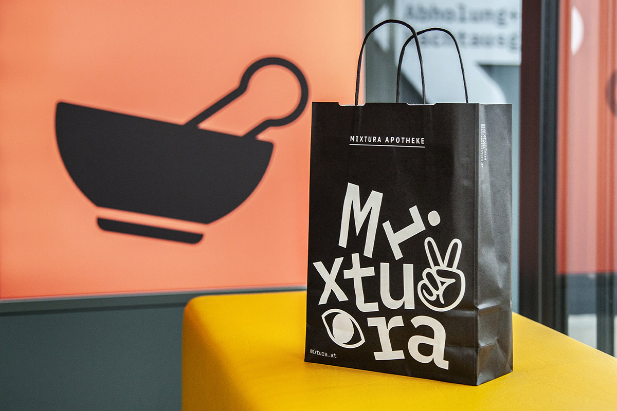
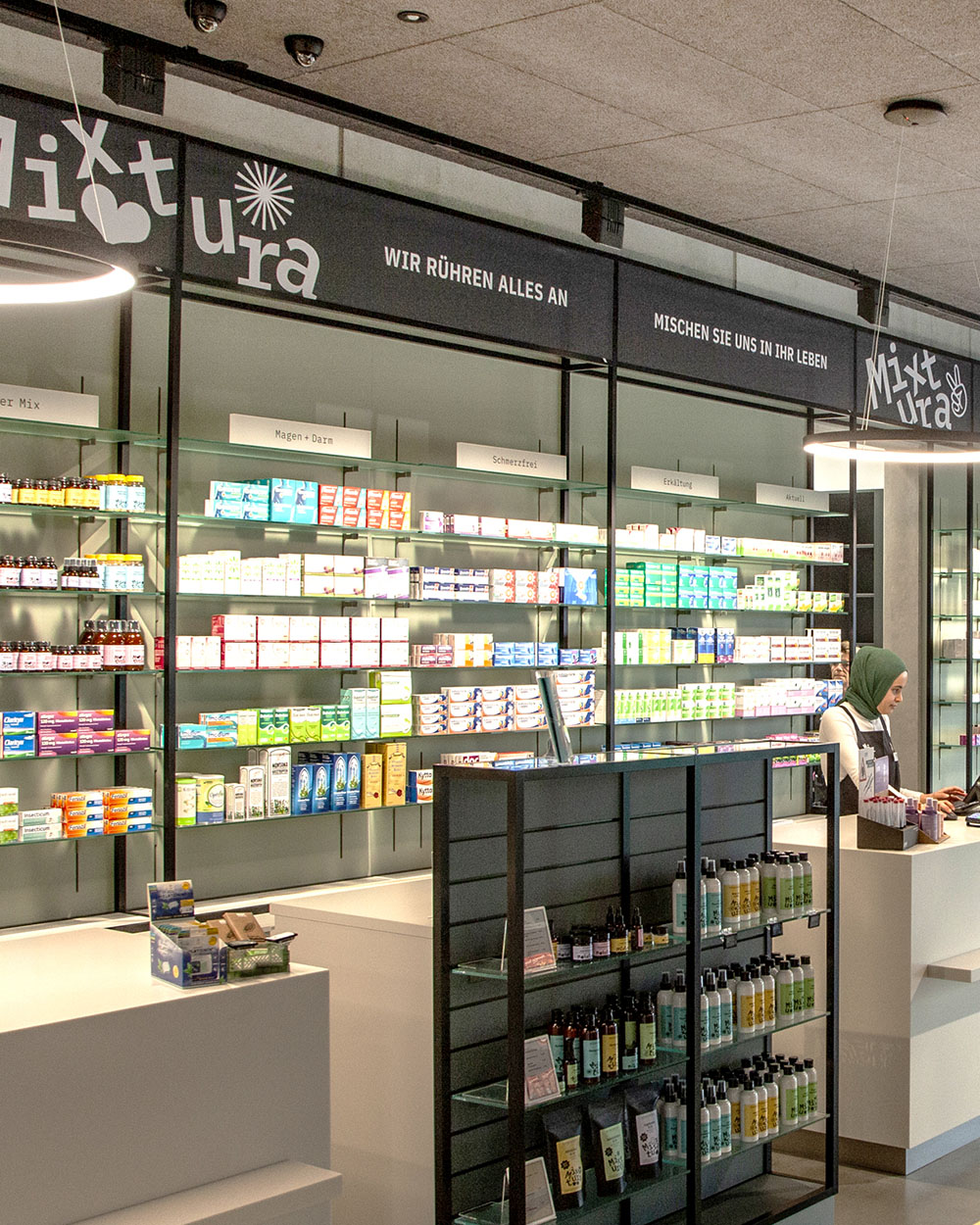
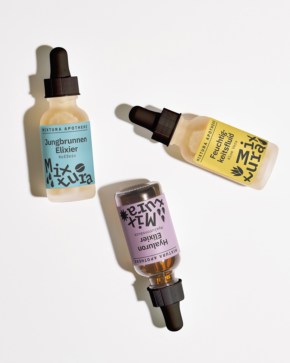
Anyone who finds themselves suffering acutely from poor design would be well advised to pay us a visit. We have various tonics and recipes that can help out in an emergency.
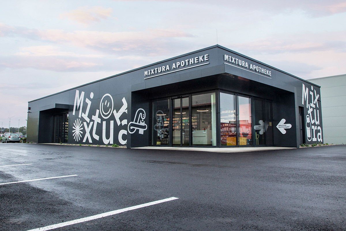
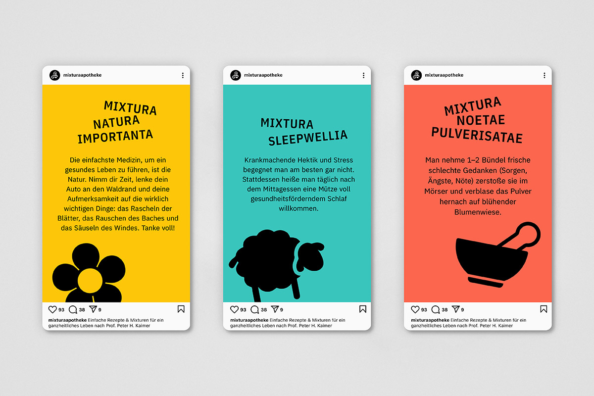
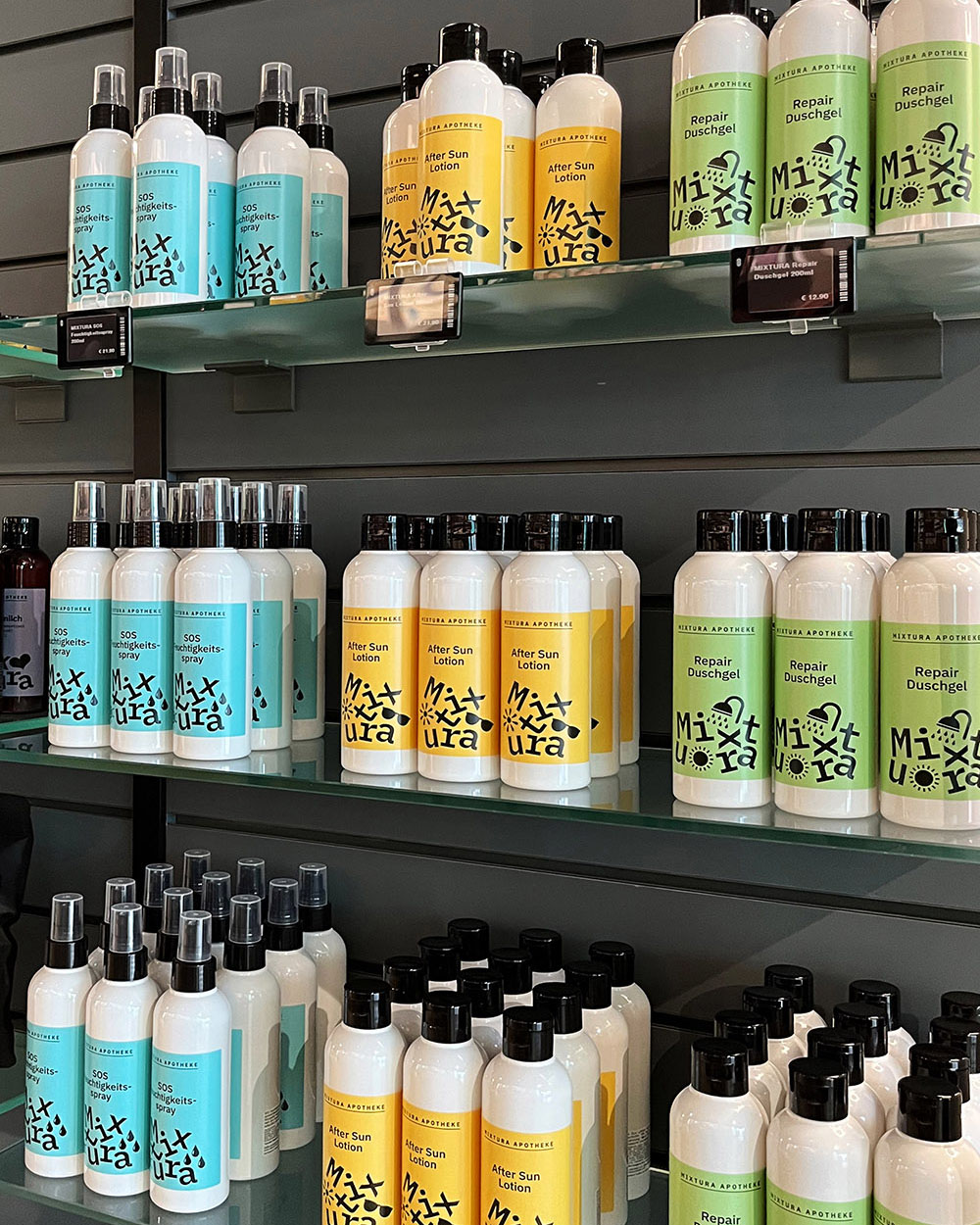
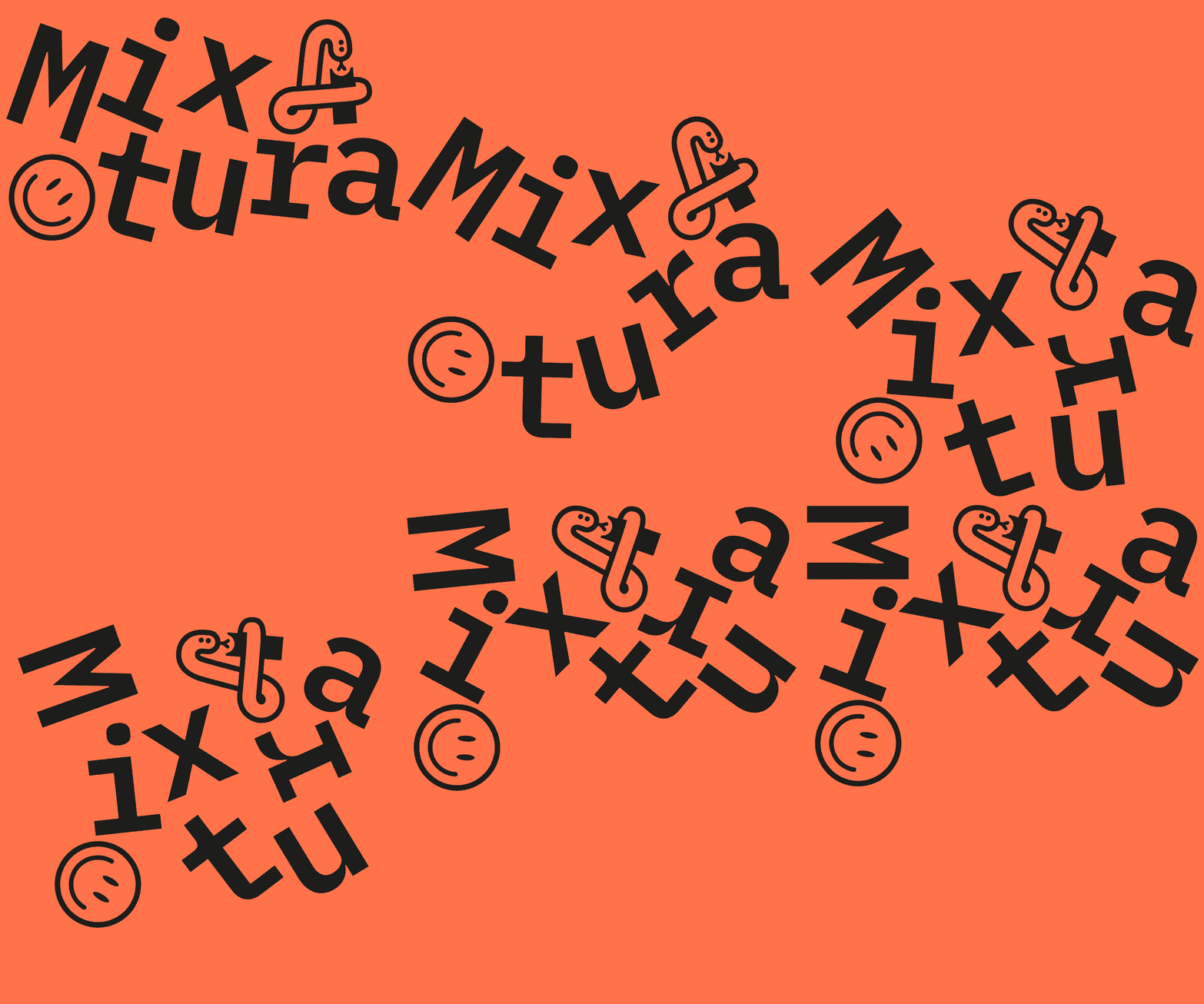
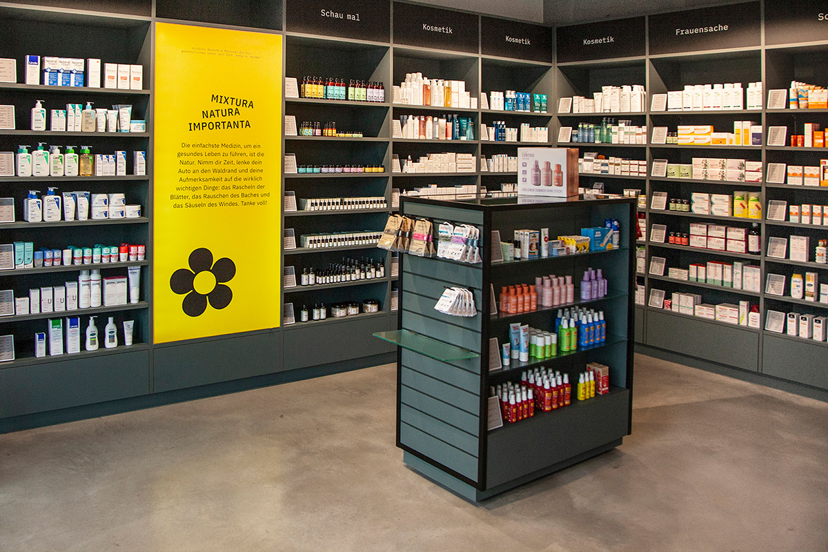
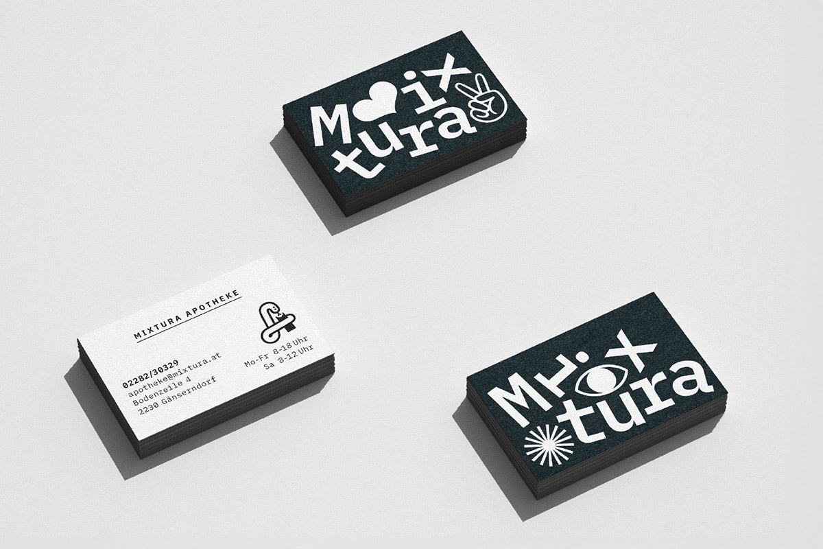
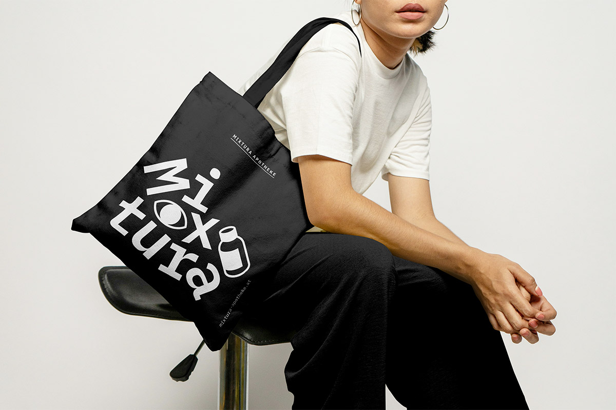
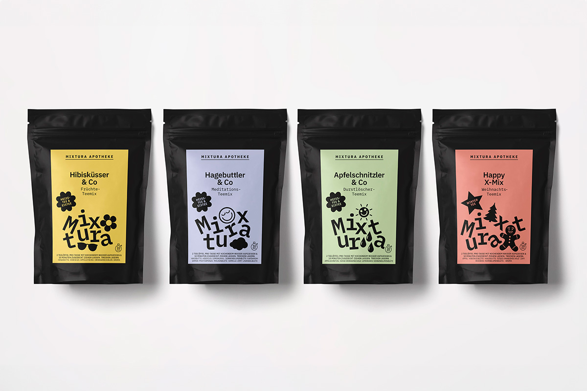
And that’s how new customer the Mixtura pharmacy co. came to us. It’s called that because we came up with a CI for them that represented a mixture of black design and next-level alphabet soup. Or was it the other way round? Anyway, never mind. The outcome was a spot-on, highly memorable design signature that will stand out in the garish hodgepodge of the strip mall architecture that defines Vienna’s suburban sprawl.
